
Webmotors
Boosting conversion rates with a button.
Webmotors
Boosting conversion rates with a button.
Webmotors
Boosting conversion rates with a button.

ROLE
UX Lead
COMPANY
Webmotors
INDUSTRY
Software Development
YEAR
2019
RESPONSABILITIES
User Journey
Research led project
Mapping business goals
Establish design collaboration
UX Writing/SEO
Design Systems
Overview
Over 20 years on the road, the first Brazilian startup innovated in buying and selling cars and motorcycles.
Market leaders and specialists in the segment are passionate about automotive culture and always give the best and safest online buying and selling experience.
Webmotors partnered with a bank called Santander to help clients get their car with financial services.
Challenges
Make the user finance a car from Webmotors pages;
Hit the target of 30 million leads sold by the end of the year from the financial simulation from Webmotos to Santander Financiamentos.


High level goals
Allow users to make a financing simulation in a safe and fast way.
Research process
How we did:
• Analysing behaviour: Heatmap (Hotjar)
• Data-Driven: Google Analytics (Number of clicks)
• User interviews
First insight:
We identified by Grafana report an issue where users weren't clicking the button to finance a car. The "Finance it" button content with the Santander bank logo looked too aggressive.
Users believed that clicking the button would enable them to finance without seeing installment options and conditions.

Key takeaways
We understood that users would feel more comfortable if the button's content was explicit about the next phase, making the experience cleaner and safer.
So, we decided to change the button's content to 'See installment' and make a/b testing using Google Analytics with the SEO team to test the navigation.
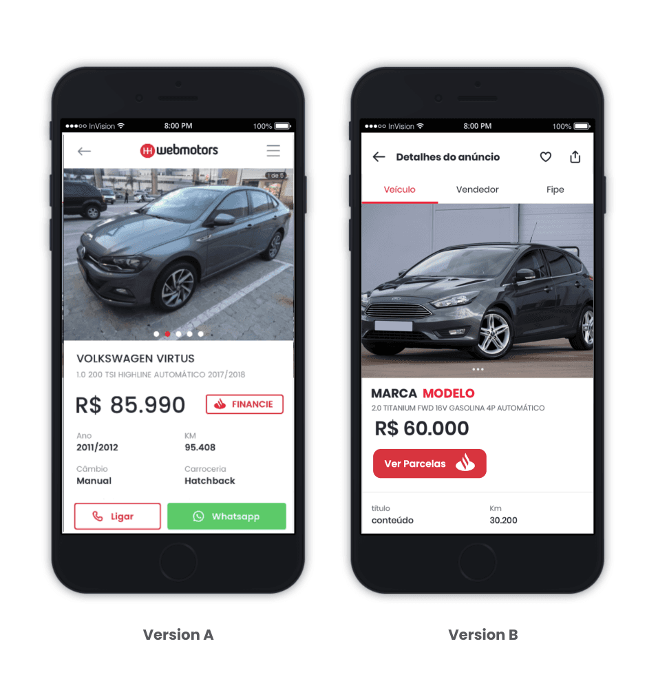
As a result, we increased over 15% of clicks on the button in version B. Raising 44% of the conversion.

Making decisions
With good results on the A/B testing, we planned to add the new button experience to the Portal desktop and mobile standards and to the app where we didn't have any financial services in production.
To validate the usability, we tested with users personally, and the test average was positive, giving us the green light to implement.
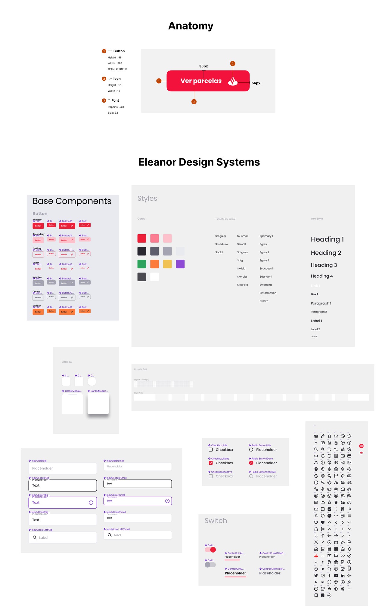
I also contributed and collaborated with Eleanor Design Systems, creating new components and documentation of the process.


Impact & outcomes
After the launch of the Web standards, we implemented the new button experience on the app;
Clear information architecture and site navigation;
The conversion was significant, hitting the target of 32 million by the end of the year;
New Landing Page was launched to explain the car financing process;
We used the new content of the new button in a different component of the e-commerce.


Let's have a virtual coffee to talk about design.
Let's have a virtual coffee to talk about design.
Let's have a virtual coffee to talk about design.
Overview
Over 20 years on the road, the first Brazilian startup innovated in buying and selling cars and motorcycles.
Market leaders and specialists in the segment are passionate about automotive culture and always give the best and safest online buying and selling experience.
Webmotors partnered with a bank called Santander to help clients get their car with financial services.
Challenges
Make the user finance a car from Webmotors pages;
Hit the target of 30 million leads sold by the end of the year from the financial simulation from Webmotos to Santander Financiamentos.
High level goals
Allow users to make a financing simulation in a safe and fast way.
Research process
How we did:
• Analysing behaviour: Heatmap (Hotjar)
• Data-Driven: Google Analytics (Number of clicks)
• User interviews
First insight:
We identified by Grafana report an issue where users weren't clicking the button to finance a car. The "Finance it" button content with the Santander bank logo looked too aggressive.
Users believed that clicking the button would enable them to finance without seeing installment options and conditions.
Key takeaways
We understood that users would feel more comfortable if the button's content was explicit about the next phase, making the experience cleaner and safer.
So, we decided to change the button's content to 'See installment' and make a/b testing using Google Analytics with the SEO team to test the navigation.
As a result, we increased over 15% of clicks on the button in version B. Raising 44% of the conversion.
Making decisions
With good results on the A/B testing, we planned to add the new button experience to the Portal desktop and mobile standards and to the app where we didn't have any financial services in production.
To validate the usability, we tested with users personally, and the test average was positive, giving us the green light to implement.
I also contributed and collaborated with Eleanor Design Systems, creating new components and documentation of the process.
Impact & outcomes
After the launch of the Web standards, we implemented the new button experience on the app;
Clear information architecture and site navigation;
The conversion was significant, hitting the target of 32 million by the end of the year;
New Landing Page was launched to explain the car financing process;
We used the new content of the new button in a different component of the e-commerce.